BodyTune
BodyTune is a research project exploring how changes in the carotid arteries could be monitored at home. For my Master’s thesis, I designed the UX/UI and product concept for a system that makes a complex medical measurement understandable and manageable without clinical assistance.
HealthTech
UX/UI Design
Product Design
User Research

Timeline
March to June 2026
Tools
Figma, Blender, Vizcom, Photoshop, Adobe After Effects
Skills / Role
UX Research, UX/UI Design, Product Design, Prototyping, Usability Testing
CoOPeration
Fraunhofer Institute for Software and Systems Engineering ISST
Context & Challenge
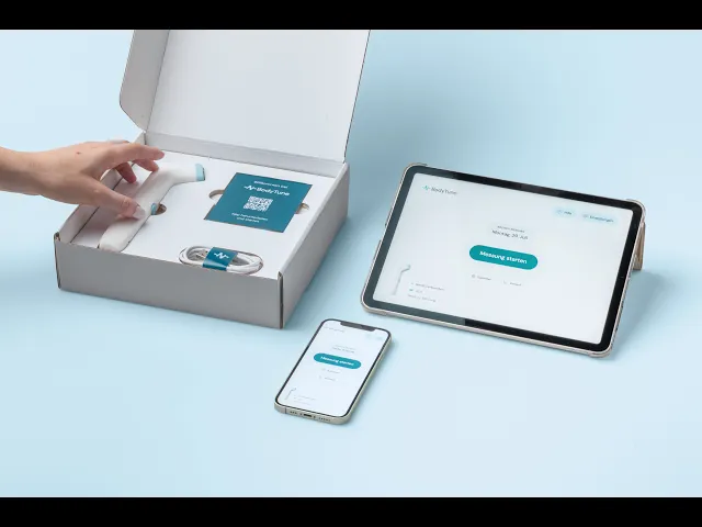
Changes in the carotid arteries can increase the risk of stroke, but often remain unnoticed for a long time. BodyTune investigates whether blood flow sounds can be recorded with a mobile device and analysed to identify relevant changes over time. The technical research was already underway. What was still missing was a clear experience for using the system at home. Where should the device be placed? How do users know whether a measurement is working correctly? And how can the result provide useful guidance without being mistaken for a medical diagnosis? My task was to translate the research project into a tangible user experience. This meant considering the interface, the physical device and the situation in which the measurement takes place as one connected system.

Research & Insights
My process followed a human-centred design approach. I reviewed the medical and technical context, existing research with potential users and requirements for digital health products. An interview with a physician involved in the BodyTune project helped me understand the clinical measurement process, common sources of error and the limitations of using the system without medical assistance. From this research, I developed personas and twelve design requirements.
Design Requirements

Personas


Design Direction
I translated the research into a feature structure, information architecture and user flow. The core journey covered onboarding, connecting the device, preparing the measurement, positioning it on both sides of the neck, reviewing the result and checking previous measurements.

At the same time, I explored the shape and handling of the measuring device. The form needed to communicate how it should be held, which part touches the skin and how user can reach the side of their neck comfortably.


Process
I first tested an early Figma prototype with five participants between 56 and 85 years old. This revealed uncertainty at several transitions in the measurement process. Some participants did not know when to place the device on their neck, while others interpreted the signal indicator as a Bluetooth status instead of feedback on the device position.

The result screen also needed more context. Participants wanted a clearer indication of what was considered normal and concrete guidance when something looked unusual. Based on these findings, I separated preparation and measurement more clearly, revised the positioning instructions, added stronger feedback for correct and incorrect placement, simplified the result categories and included a clear recommendation for the next step.

Final Solution
The final concept guides users through the measurement one step at a time. It clearly communicates which side of the neck should be measured, where the device needs to be placed and whether the position is correct. The recording only begins once the necessary conditions are met.


Results are organised into three understandable levels: no abnormalities, slight abnormalities and significant abnormalities. Instead of presenting medical raw data, the first screen explains what the result means and recommends an appropriate next step. More detailed information remains available for users who want it. Previous measurements can be reviewed over time and exported as a PDF for a healthcare professional. Reminders help users build the measurement into their routine.


Final User Testing
The main user group consisted of 17 people between 55 and 85 years old, with an average age of 68.5. A care professional also participated to provide the perspective of someone supporting the measurement at home. The prototype received an average System Usability Scale score of 93.9 out of 100. Almost all scores were in the excellent range, with the lowest still reaching 75. Participants with lower confidence in using technology also rated the experience highly. Most tasks were completed independently. The remaining difficulties were mainly connected to the physical interaction, such as finding the correct spot on the neck or remembering which side to measure first.

System Usability Score

Brand Concept
The final brand concept positions BodyTune as calm, trustworthy and clearly medical without feeling cold or intimidating. A restrained colour palette, generous spacing and clear typography make the system easy to understand, while the visual identity connects the app, measuring device and packaging.


Reflection
BodyTune taught me that designing medical technology is not only an interface challenge. The experience is shaped by the combination of information, physical interaction, personal uncertainty and the wider healthcare context. Testing early with older participants was particularly valuable. It challenged several of my assumptions and helped me create a solution that felt clear, credible and approachable to the people it was intended for. The prototype could only simulate the automatic position detection and measurement. A next step would therefore be to test the concept with a functional device and people who have been diagnosed with carotid stenosis. This would show how BodyTune performs over time and how it could fit into real healthcare routines.