Carey
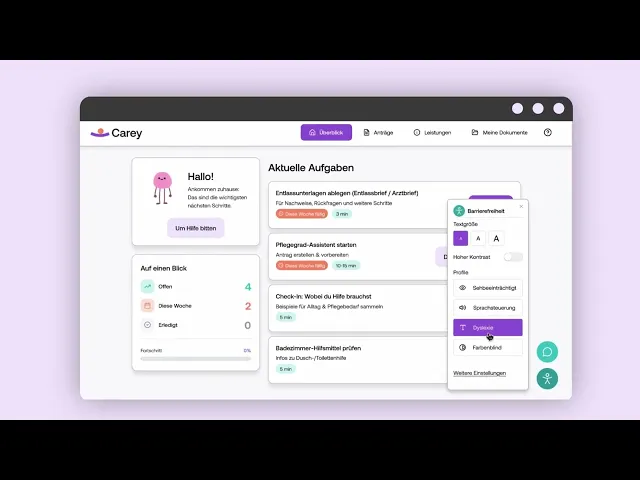
Carey is a digital tool that helps people navigate bureaucratic processes within the German care system. It brings applications, benefits and documents together, making it easier to understand what needs to be done and what happens next.
Social Design
UX/UI Design
Accessibility
User Research

Timeline
October 2025 to January 2026
Tools
Figma, Adobe After Effects
My Role
UX Research, UX/UI Design, Information Architecture, Prototyping, User Testing and Visual Identity
Project
Individual university project
Context
Applying for care support in Germany can involve long forms, unclear responsibilities and communication with several organisations. People often need to research available benefits themselves, submit the same information multiple times and keep track of processes that take several weeks.
For people with physical limitations and relatives providing care, this creates additional pressure during an already difficult situation.
Carey explores how these processes could become easier to understand and manage. Instead of redesigning a single form, the concept supports users throughout the application journey.

Research
My research combined interviews with affected people, relatives and experts, an international survey, forum analysis and the observation of someone completing an application for respite care.
Across the different methods, the same needs appeared repeatedly: clear next steps, understandable language and reliable information about the status of an application. The emotional side of bureaucracy was just as relevant. Many people worried that a mistake or missing document could prevent them from receiving support.
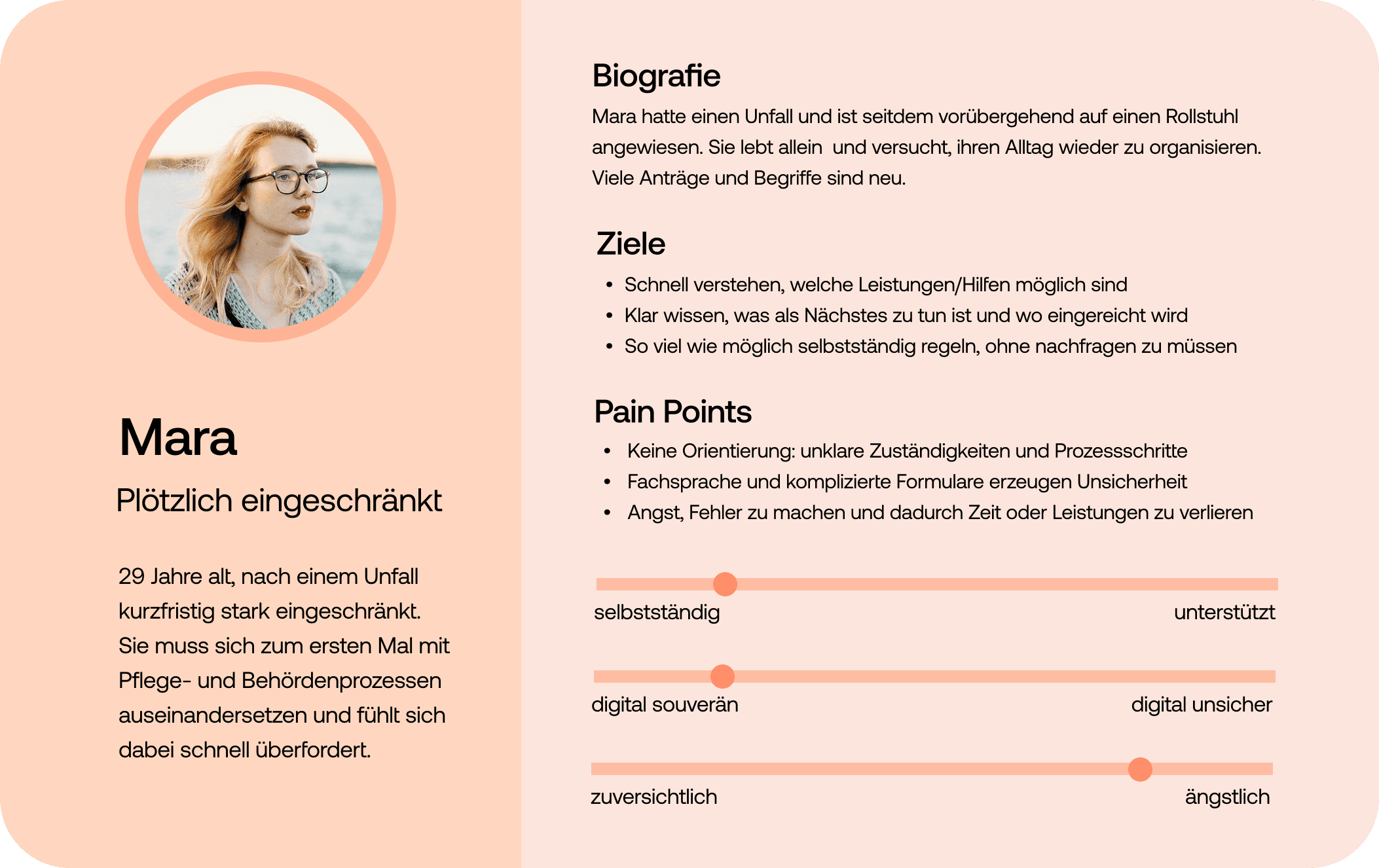
I translated the findings into empathy maps and two personas representing different life situations and levels of independence.
Personas

Concept
I used a concept map to connect the main problems with possible features. These were grouped into four areas: Overview, Applications, Benefits and Documents.

Early sketches and wireframes helped me test the structure before moving into the visual design.
Instead of following the internal structure of authorities, Carey organises information around users’ situations. A user flow following a hospital stay connected the different areas into one journey, from uploading a discharge letter to applying for a care level and tracking its progress.


Visual Identity
Carey needed to feel calm, supportive and approachable as a contrast to an often stressful and impersonal system.
Moodboard

The visual identity uses soft colours, generous spacing and friendly illustrations. The logo shows a curved line balancing a sphere, representing support and stability throughout the process.

Four illustrated characters accompany users across the interface. They add warmth to the experience and help make administrative content feel less distant.

User Testing & Iteration
I tested the prototype with four people, including two people directly affected by care processes and two relatives. They completed several tasks based on the main user flow.
The tests showed that upcoming tasks needed to be easier to identify on the dashboard. Participants also wanted to understand the practical value of each care benefit, for example whether it offered financial or organisational support. On the application page, the current status and remaining steps were not visible enough.
Based on this feedback, I reorganised the dashboard, added clearer explanations to the benefits overview and gave the application status tracker a more prominent role.
Final Design
The final Carey prototype brings the main parts of the care application process into one system.
Dashboard
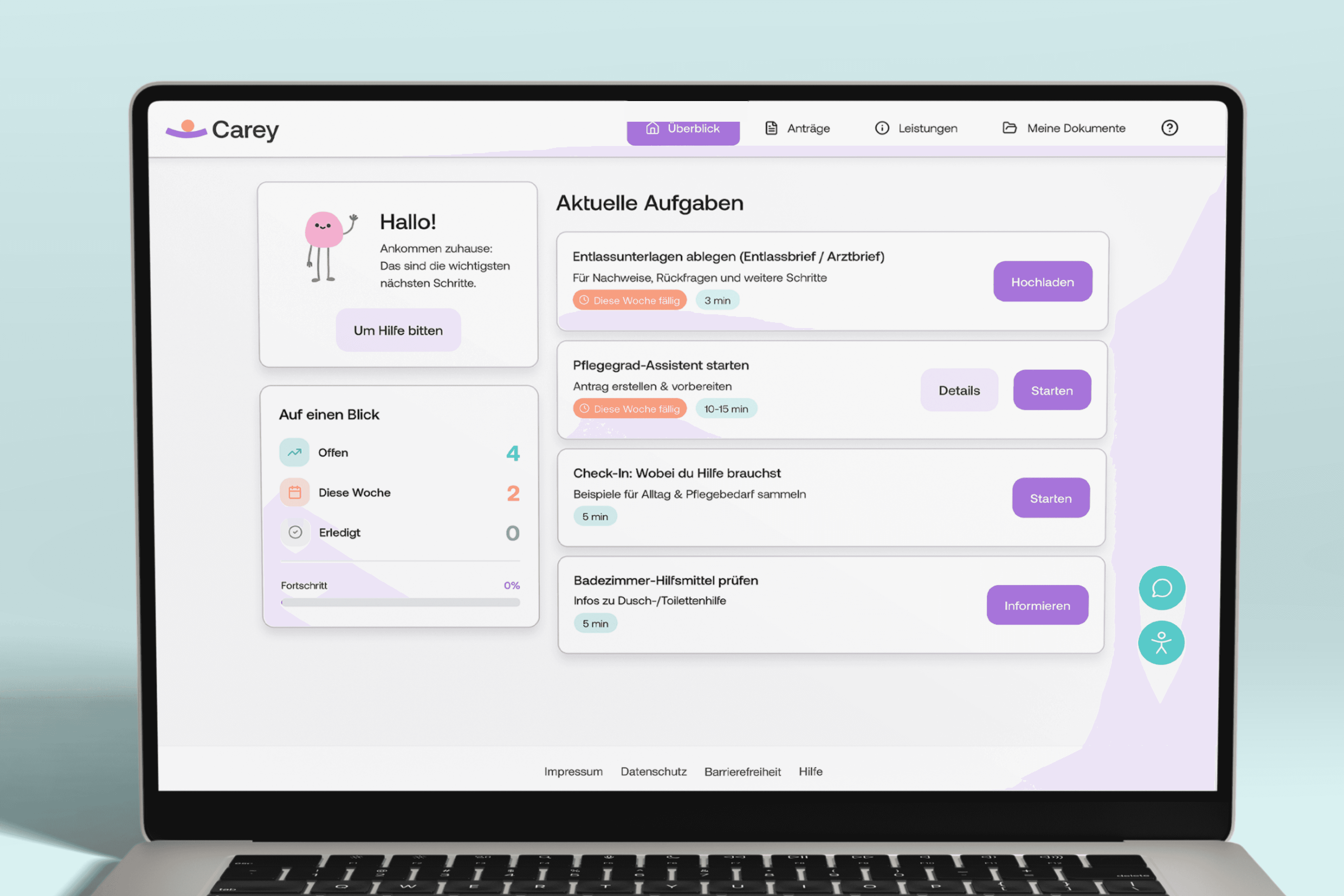
The dashboard highlights current tasks, deadlines and application updates. It helps users understand what requires attention first without showing every available function at once.
Applications
Applications are divided into manageable stages. A status tracker shows what has already happened, the current state of the application and which steps will follow.

Benefits
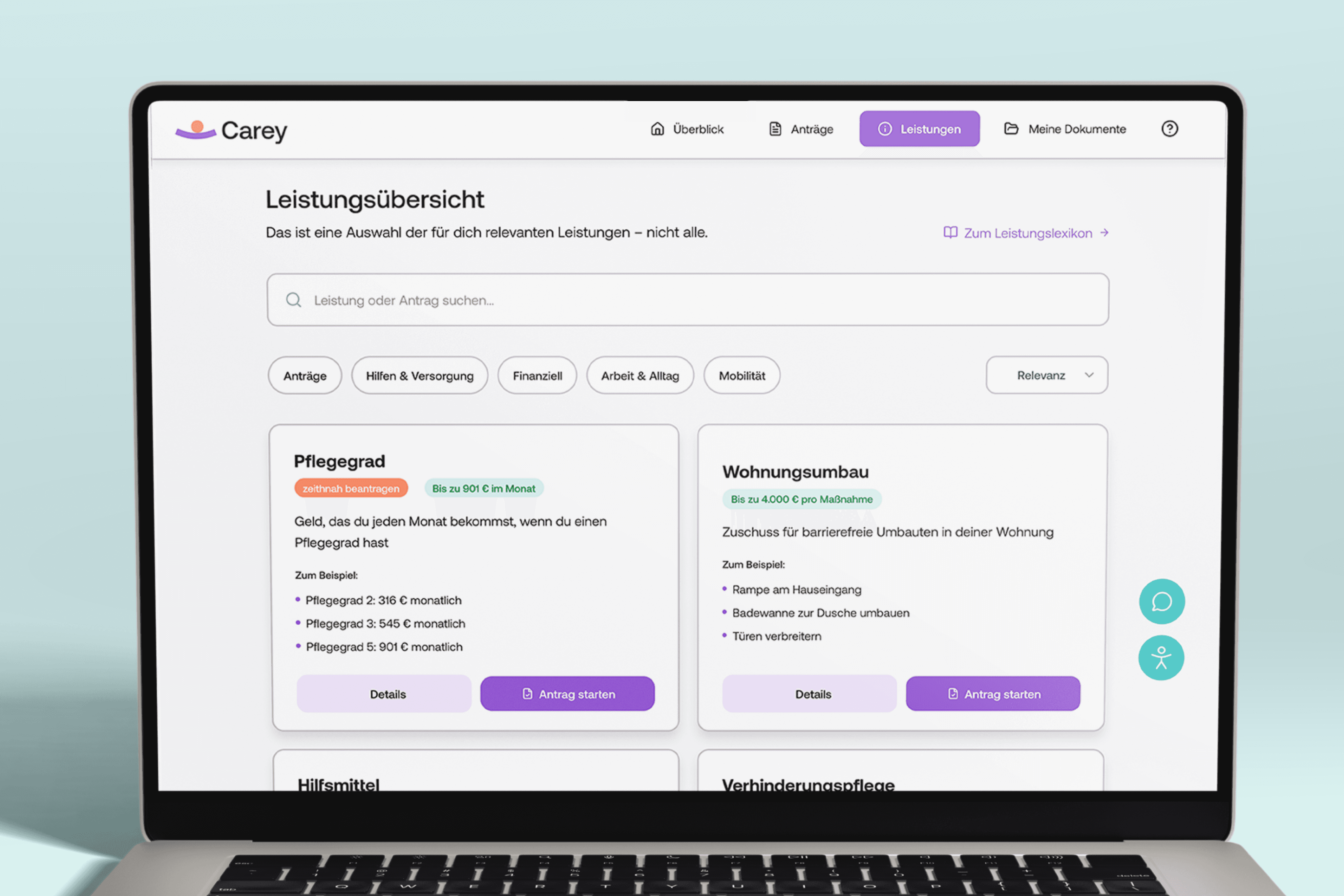
The benefits section explains available support in plain language. It also shows how each benefit could help, for example financially or by reducing the organisational workload of relatives.
Additional Features
Personalised onboarding prepares the application for each user’s situation. A chat provides help during the process, while accessibility settings allow users to adjust text size and contrast. A dedicated relative mode supports people who manage applications on behalf of someone else.

Reflection
Carey started as an exploration of digital forms, but the research revealed a much larger problem. The greatest challenge was not completing one application, but navigating a fragmented system of benefits, responsibilities and organisations.
The project showed me how much clear language, thoughtful structure and visible process feedback can reduce uncertainty. At the same time, a digital tool cannot remove the structural complexity of German care bureaucracy.
It can, however, make that complexity easier to understand and manage for the people affected by it.