MediMind
MediMind is a health app that helps people keep track of preventive checkups, book medical appointments and access important health documents in one place. The concept was developed through a Lean UX process with continuous user testing and iteration.
HealthTech
UX/UI Design
Lean UX
User Research
Timeline
October 2023 -
January 2024
Tools
Figma, Miro
My Role
UX Research, UX/UI Design, Prototyping
and User Testing
Collaborators
Sarah Russ, Mandy Steiger, Matthias Pilz and Michael Schubert
Context
Existing health apps already support areas such as medication, health data and communication with doctors. However, users still lack a clear overview of upcoming routine checkups and often need to contact practices through complicated or fragmented booking processes.
MediMind was created for busy, health-conscious adults who want to take care of their health but struggle to keep track of appointments, available services and medical documents.
Our goal was to make preventive care more visible and easier to organise.

Product Idea
The first concept focused on four areas: an overview of upcoming preventive checkups, simple online appointment booking, health-related reminders and notifications, and digital access to medical documents.
We developed personas representing different situations, including a mother managing appointments for herself and her child, as well as a young adult with little knowledge of health insurance benefits or preventive care.
From this, we formulated two central hypotheses: a clear overview would increase awareness of routine checkups, and online booking would make arranging appointments less stressful.

Testing & Iteration

We began testing early with a low-fidelity prototype and continued throughout the project. Across five rounds, the team conducted 55 user tests. We also used card sorting and A/B/C testing to examine individual features and navigation decisions.


The feedback changed the product several times. Users preferred a calendar view for appointments and found the original profile too crowded. The search for doctors was too complicated, and the benefits overview was difficult to find within the existing navigation.
Card sorting helped us reorganise the app around clearer categories. Later tests showed that a dashboard made the app easier to use and that the central position worked best for the new appointment button.

Further testing focused on details such as prescriptions and medication information. Some screens contained too much text, while labels such as “redeem” sounded more like a voucher than a medical prescription. These findings helped us simplify the content and choose clearer wording.
Final Design
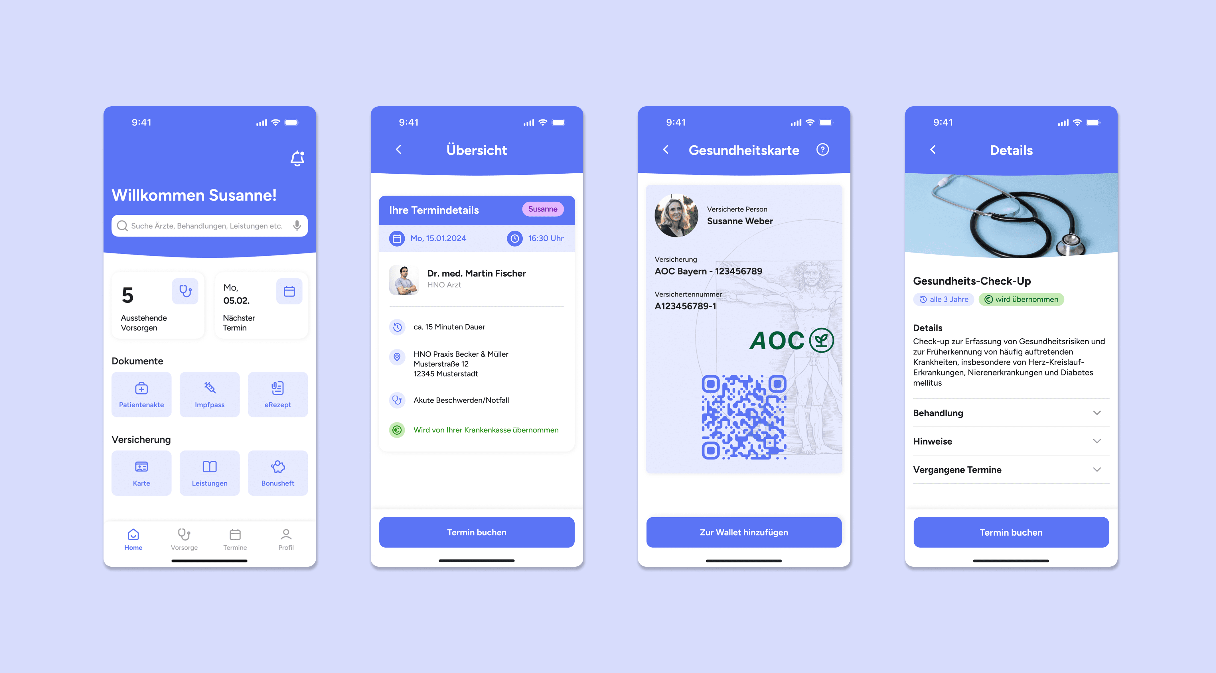
The final MediMind prototype brings the most important health tasks together on one dashboard. Users can immediately see upcoming preventive checkups, their next appointment and shortcuts to frequently used features.
The preventive care section provides an overview of recommended examinations and helps users understand which checkups are due. Appointments can be viewed in a calendar and booked directly through the app.

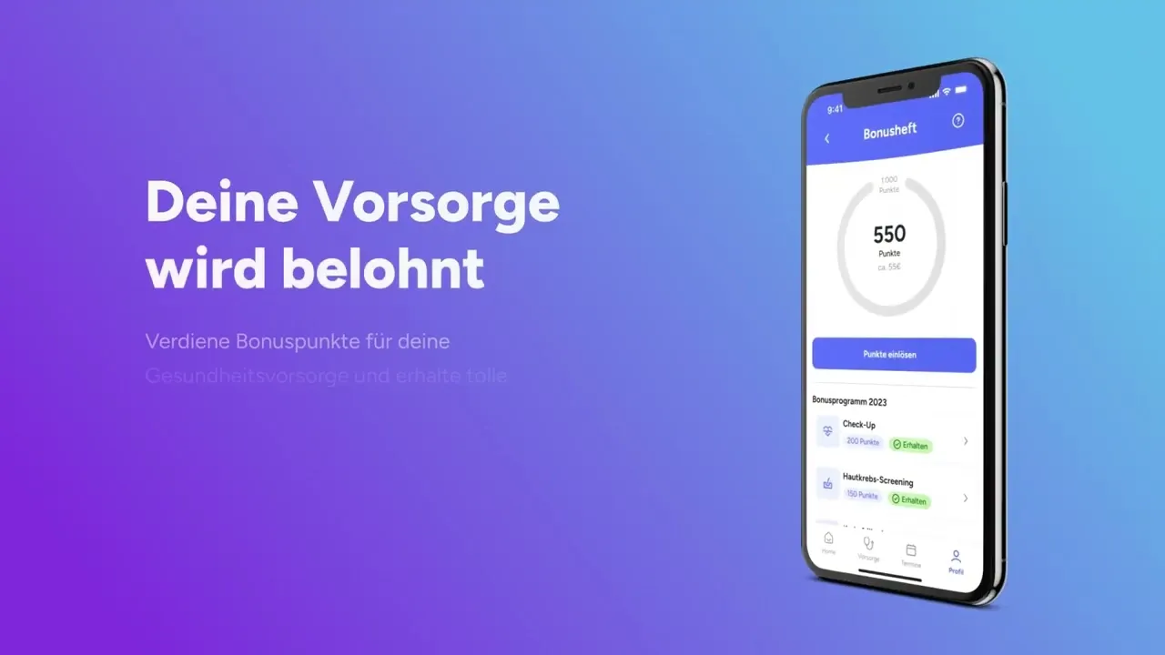
Additional areas provide access to health insurance benefits, medical records, prescriptions, vaccination records, medication and saved doctors.
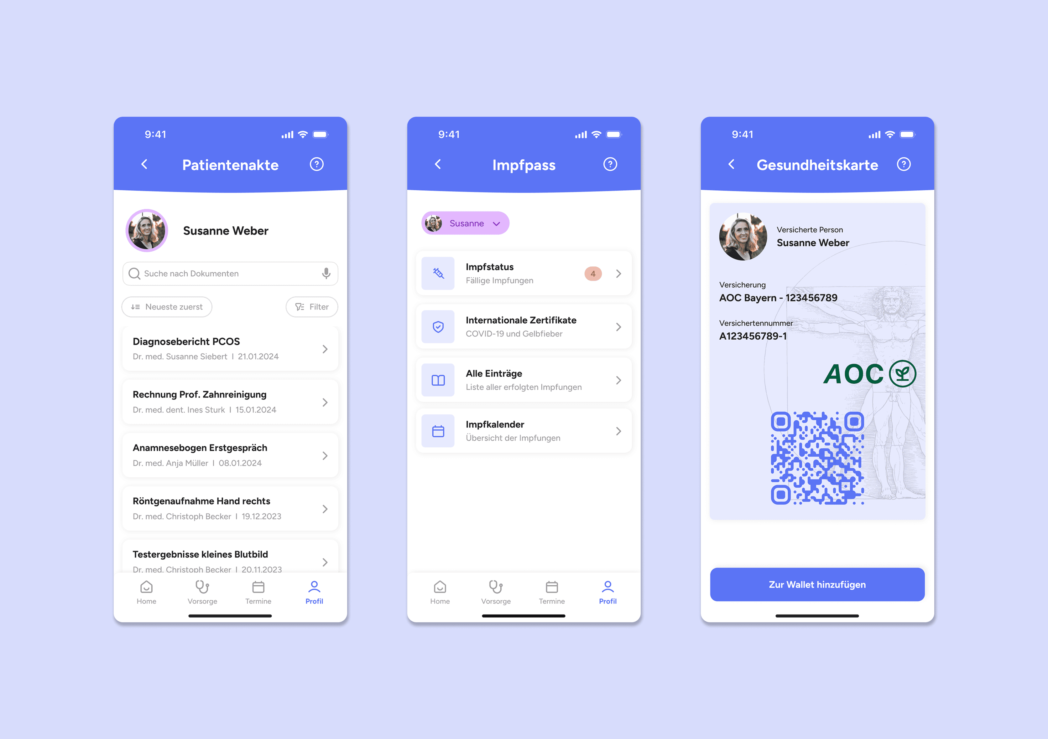
The final tests supported both initial hypotheses: participants found the overview helpful for keeping preventive checkups in mind, and the online booking flow made arranging appointments feel easier.

Reflection
Starting with an early prototype gave us enough time to test, adapt and develop a detailed high-fidelity concept. Continuous feedback helped us identify usability problems before they became part of the final structure.
In retrospect, we would have introduced card sorting earlier, as it had a major impact on the navigation. We also learned that internal decisions need to be documented more consistently in a fast and iterative process.
A real implementation would require further work on data protection and cooperation with health insurance providers. The long-term idea would be a consistent solution for preventive care across the German healthcare system.